Jump to content
Bombardiere

Bombardiere's London/ English Bats

228 posts in this topic Last Reply

Highlighted Posts

Posted:
Last Online:  
 

I am personally addicted to HD content, I don't play in z6, but I do like to take screenshots there and so the look of z6 is probably more important to me than z5.

The thing is, the nature of HD models means you trade z5 quality for z6. When you render in HD, z5 uses a down-scaled version of the z6 texture. As opposed to an up-scaled z5 texture being used for z6 with SD models. I'd hazard a guess the brick pattern, due to the number of bricks, when being manipulated in this way gets fuzzy as a result. The roof with it's larger tiles is clearly not suffering so much from the same problem.

Short of changing the brick texture for something less complex, I think there isn't a lot you can do about it, shame we can't have a sixth texture in addition to the other five :(.


Head over to my Lot and Mod Shack to keep abreast of my latest developments.

Do you like custom textures, but don't like all the work involved creating them?, take a look at the Texture Automation options here. Change the look and feel of your transit networks, with the minimum of effort, for example customised versions of my Sidewalk NAM (SWN) and Terrain Grass NAM (TGN) mods, and much more besides.

New to the NAM? Check out my tutorials on YouTube. Latest upload: How to: RHW - MHO Roundabout Interchanges. (Nov 25).

p.s. - I'm MGB over on SC4D and a member of the NAM team.

Share this post


Link to post
Share on other sites
  • Original Poster
  • Posted:
    Last Online:  
     

     Zoom 6 is a zoom you don't normally play in, so I think it's not too relevant.

    Me, me, me, me, me, me ... I want to marvel at all beautiful buildings. :D 

    Rsc204 pretty well summed up it. It is a trade of. The building on the right is a HD building too.(I do not remember who made it, I think I have found it on TSC.) It suffers less, but "distortion" can be seen on the roof tiles too. 3DS MAX plug in script might be slightly better. I have made some trials, but I have to see until I make the first building with MAX. But it is the brick texture or similar pattern textures.

    So at least for Rue Jeanne D'Arc I will offer two version, so people can choose their own.


    • Like 1

    Share this post


    Link to post
    Share on other sites
  • Original Poster
  • Posted:
    Last Online:  
     

    After a long break, I have finally uploaded my Paris Rue Jeanne D'Arc. enjoy :yes:


    I have been quiet, but I have totally stopped Batting. I have moe Georgian Rowhouses under construction, but my issues with 3DS MAX 2014 have prevented to finalise anything. Render is fuzzy in my computer and I haven't found a solution. So no preview this time.


    • Like 3

    Share this post


    Link to post
    Share on other sites
  • Original Poster
  • Posted:
    Last Online:  
     

    I haven't fully solved my fuzzy render problem, but Girafe has helped me and gave a scene which I can use for rendering. Thank You Girafe.


    So I continue this thread. I copy the text I wrote, which was moderated into 3DS Max troubleshooting thread as this sparked a lively discussion on alpha channels and grey lines in the render


    Quote

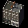
    Anyway, I have continued with my Georgian obsession. More Georgian townhouses. This one is based on a real on Clerkenwell Close 47-52 In Clerkenwell London. Not far from Farrington Road and Smithfield Marker.


    Originally this was a block of 6 house, but today only two remains. The rest of were demolished in 50's to make room for Church Garden. These two were partically rebuilt because the houses were in bad shape. The roof has today different shape from the drawings and a picture dating from 30's, which I used as the guidelines.


    The textures are not yet final and I am working with those. The yellow brick is modern and the houses may originally had different brick colour, but I stick with it. The windows are not black, but dark grey reflection. That does not show well in the render, so I have to work with it. I guess many will say that the roof texture is repetitive. I may keep it or think something else.


    However, the main thing with this townhouse is that this time I do the corners. Commercials. Shops and this pub one. I got the inspiration from a real pub close by. The Horseshoe.

    So, I am finalising the day renders and start to work with the night render. This is the first time I attempt a Dark Night model and proper night lights. So I have some fine tuning to do and I may want to add some lamps outside the pub.


    Clerken1_zpspnov7qso.jpg

    Clerken2_zpsud8h13kq.jpg

    Clerken3_zps7zbbkwl9.jpg

    Clerken4_zps7grim1sk.jpg

    Clerken5_zpsovyz6ibx.jpg

    Clerken6_zpsogkdyive.jpg

    Clerken7_zpshygua7gs.jpg

    Clerken8_zpsiqtxami5.jpg

    • Like 7

    Share this post


    Link to post
    Share on other sites
    Posted:
    Last Online:  
     

    The buildings are looking great. You're doing a very nice job :)
    Is your "Illuminate the scene" option activated in the self-illumination?


    Imagem

    "If you fall I'll be there"
                         -The Floor

    Share this post


    Link to post
    Share on other sites
    Posted:
    Last Online:  
     

    So.... uhhhh.... needless to say, you've improved dramatically. :uhm: 

    My only comment is that the textures seem to be dark and saturated. This is something that naturally happens because of how our eyes look at colors and try to balance them. When something is too dark and it looks wrong, we try to compensate it by making it more saturated. And when something is too saturated and looks wrong, we try to compensate by making it darker. For example your green painted wood texture is as dark as the black asphalt in the game.

    The easiest way to check this is to put the building into the game's environment (photoshop a preview render into a screenshot), and then completely lower the saturation to make it black and white. Then adjust your textures until their brightness/darkness is what you think they should be. And then after that the textures might look too saturated or not saturated enough, and so change the saturation until they look correct. 

    You can also use this technique with photographs to understand the relative brightness/darkness of real life materials. For example it would surprise most people to learn that grass and tress are actually some of the darkest objects in most photographs. We normally don't think of grass as being "dark" but it is.

    • Like 2

    patreon.png    PATREON    •    MIPRO    •    MY BAT & TUTORIAL THREAD

    Share this post


    Link to post
    Share on other sites
    Posted:
    Last Online:  
     

    My good god! That looks amazing. I would follow the piece of advice from above.. The green painted wood looks a tad too dark.. On the other hand, it is so good to see you back and batting.. It appears that Brit bats are making a comeback lately.. I've seen some interesting content over at sc4devotion too... Hopefully this is the beginning of something.. I never grow tired of your work!

    Share this post


    Link to post
    Share on other sites
  • Original Poster
  • Posted:
    Last Online:  
     
    11 hours ago, Jasoncw said:

    My only comment is that the textures seem to be dark and saturated. This is something that naturally happens because of how our eyes look at colors and try to balance them. When something is too dark and it looks wrong, we try to compensate it by making it more saturated. And when something is too saturated and looks wrong, we try to compensate by making it darker. For example your green painted wood texture is as dark as the black asphalt in the game.


    Yeah I have been fighting with the fuzzy render so long that I haven't had  time to  import these in to the game. That would be the next step.

    The only texture I have adjusted is the roof, so I haven't tried to compensate anything. But yes, I think that SC4 aims for a sunny day and mine are bit wet and damp. Like England. :yes:  I know that the colours look very different if a photo is taken on sunny day than on cloudy day.

    The camera is very different in 3DS MAx. At least in my computer, I don't know how it is with others. While GMAX was horrible bleach then 3DS Max darkens everything. (Which off course is a different thing than saturation.)

    How does the brick texture looks? That is the main thing. Do you think that it would need to be adjusted?

    I use GIMP for picture editing. Can anybody advise, which tools to use for saturation?


    Quote

    Is your "Illuminate the scene" option activated in the self-illumination?

    Probably not as I don't know this option. :yes: Where is that tool located?

    Share this post


    Link to post
    Share on other sites
    Posted:
    Last Online:  
     

    Inside the 'Self Illumination' button, where you made your texture be self illuminated, there's also this option.

    • Like 1

    Imagem

    "If you fall I'll be there"
                         -The Floor

    Share this post


    Link to post
    Share on other sites
    Posted:
    Last Online:  
     

    You don't actually need to export things to test them in the game. In the game, take zoom 5 screenshots (and maybe a few zoom 4 and 6 ones too), and put them into a file in GIMP. Then after you do a preview render, save it as a .png, with transparency. Open up the preview render file in GIMP and then combine it with the SC4 screenshots. :) 

    My guess is that *all* of the textures except for the window frames are too dark and saturated. But I'd be able to give more specific advice if I saw the original buildings.

    As far as editing in GIMP goes... this is one of the main shortcomings of the program. There is not non-destructive adjustments in GIMP. The best you can do is go to Select>All (to select your entire image), then Edit>Copy Visible, and then Edit>Paste As>New Layer. The end result will be a flattened version of your entire texture in one layer that you can adjust without making changes to the original layers. After that you can go to Colors>Hue-Saturation or Colors>Brightness-Contrast. You can also go to Colors>Curves for more precise control (for example, you could make the dark parts of an image brighter without affecting the medium and bright parts of the image). If you want to try that now you can google about it or ask me more and you can try it out, but it's not as intuitive as the normal Brightness-Contrast and Hue-Saturation, and those would probably be good enough for what you need to do 95% of the time anyway.

    But you can imagine doing all of this every time you want to make a change to your texture would be difficult and would take a lot of time. Photoshop doesn't have this problem because it has what are called Adjustment Layers which allow you to make changes to your layers without directly changing them. 

    But luckily these tools also exist in 3ds Max. It's called a "Color Correction" map. Now normally you put your texture's image file inside a bitmap, and you put the bitmap map where you need it. To use this you need to put the bitmap inside of a color correction map, and then have the color correction map where you need it. So if you were starting a material from scratch, you would first click on the empty slot, and instead of selecting Bitmap, you would select Color Correction. And then while looking at the Color Correction map, at the top of it there's a spot that says "Map: NONE" and you click on the NONE and then select bitmap, and then load your texture file as normal. 

    If you already have the material with the bitmap already made, you can still add in a color correction map without having to remake the material. While viewing the bitmap, look near the upper right hand corner where it says "Bitmap" inside of a button. If you click that a list of map types will pop up. Select Color Correct. A new pop up will happen asking you whether you want to "discard old map" or "keep old map as sub-map". The first option will replace the bitmap map with the color correction map. The second option will make a color correction map and will automatically put the old bitmap map inside of it. 

    I know you're new to max so if this is confusing tell me and I'll make a better explanation. :) 

    At this point I can also point out that there is a map type called "Composite" which basically creates a layer system. So you can put maps into layers and change their opacity, or change their blending mode to multiply or overlay, etc. 

    • Like 5

    patreon.png    PATREON    •    MIPRO    •    MY BAT & TUTORIAL THREAD

    Share this post


    Link to post
    Share on other sites
    Posted:
    Last Online:  
     
    12 hours ago, Bombardiere said:

    Yeah I have been fighting with the fuzzy render so long that I haven't had  time to  import these in to the game. That would be the next step.

    The only texture I have adjusted is the roof, so I haven't tried to compensate anything. But yes, I think that SC4 aims for a sunny day and mine are bit wet and damp. Like England. :yes:  I know that the colours look very different if a photo is taken on sunny day than on cloudy day.

    The camera is very different in 3DS MAx. At least in my computer, I don't know how it is with others. While GMAX was horrible bleach then 3DS Max darkens everything. (Which off course is a different thing than saturation.)

    How does the brick texture looks? That is the main thing. Do you think that it would need to be adjusted?

    I use GIMP for picture editing. Can anybody advise, which tools to use for saturation?


    Probably not as I don't know this option. :yes: Where is that tool located?

    Jason beat me to the colour correction feature in 3DS Max which is really nifty when you have made yourself a good base texture and then you want to amend it quickly :thumb:

    But, in terms of the gimp, I have to disagree with Jason - it does handle layers well and non-destructively by adding masks (especially in terms of texture mapping for SC4) - I would recommend reading this: https://www.gimp.org/tutorials/Layer_Masks/ and if you are interested further, look for you-tube tutorials on lone.

    To answer your question re saturation, you use Colors>Hue-Saturation.

    You will spend a lot of time in this window as you also need to adjust your BAT's image colours in this window as they are not accurate at the moment - it isn't a case of them just being too dark or saturated. This window has quite a deal of control as you can adjust the saturation and values of each colour independently (as well as all the colours together).

    I've added your building to a background of Clerkenwell Rd (by looking at it, this was shot on a sunny day around late April) and I have picked a building (the red brick one on Clerkenwell & Britton) that is similar to those you are modelling.

    Your roof slate has an overly blue base and many slates have an ochre base.

    Those slates that do have a blue base are usually at a much lower set of values than yours as well as far more red. 

    Aim for say a value of H224 / S10 / V60 & R137 / G141 / B152 on your darker blue areas and see how you go.  

    Using the eyedropper tool, I have taken a sample of both roofs to illustrate - the RGB & HSV values. Bear in mind I don't use Bing/google maps to get the exact colours of my buildings but it is a powerful sanity check.

    You will also need to check the tiling of your roof: there is a rather obvious lack of tiling about half way up. One thing I did many years ago was utilize the maxis roof texture (which came with Gmax), tiled it, repeated it to make it 1024x1024 and added a gradient so that I could re-colour it easily (or add dodge/burn etc).

    I've attached their roof tile texture here. As they gave it to us, theirs is not tileable, but it can be corrected easily. Once you have a base texture that you can re-use, it speeds up your workflow tremendously as you can recolour in the gimp (or nowdays, in 3dsMax)

    You'll need to go through a similar process for the bricks, terracotta and painted woodwork elements


    London1.JPG

    MaxisPitchedRoof.jpg

    • Like 3

    Share this post


    Link to post
    Share on other sites
  • Original Poster
  • Posted:
    Last Online:  
     
    15 hours ago, Jasoncw said:

    You don't actually need to export things to test them in the game. In the game, take zoom 5 screenshots (and maybe a few zoom 4 and 6 ones too), and put them into a file in GIMP. Then after you do a preview render, save it as a .png, with transparency. Open up the preview render file in GIMP and then combine it with the SC4 screenshots. :) 


    Sure, I am aware this trick, but at the moment I don't have a city. I need other BATs to compare with. I notice that my monitors (and eyes :yes: ) are lying. Here at the office the textures are very dark indeed and the google earth image MATTB325 posted is about right, but back home (where I do my model work, obviously :D) the buildings are okeyish, but Matt's posted image is really bright. I guess I need to adjust my monitor and my eyes.


    Quote

    .I know you're new to max so if this is confusing tell me and I'll make a better explanation. :) 

    I got it, thanks. Seems to be easy to use. Now I only need to figure out what to do with the tool. :???: 


    Okay, I probably don't need to defend me, but the "darkness" and "saturation" were, at least partly, done in purpose. I wanted to do low wealth residentials and commercials and in back of my mind there was a grey dirty look. I post here a picture from London Survey volume 46 of real life Clerkenwell Close buildings in 1930's

     fig15_zps1gn7sxr1.jpg


    Black and white picture yes, but it still gave me a dark and dirty feeling. I haven't tried to model these houses precisely, just as an inspiration. So I will do a test with clean texture and I will post it here, to see how much there is my overeagerness and how much I need to adjust my textures.

    Quote

    I've added your building to a background of Clerkenwell Rd (by looking at it, this was shot on a sunny day around late April) and I have picked a building (the red brick one on Clerkenwell & Britton) that is similar to those you are modelling.

    I think I recognise the old assembly building in the middle of the picture. If so, the real life buildings were located, just outside of the picture. On the top where few trees can be seen. I think that is St. James Church garden and the buildings were next to it. Today only two houses remain.


    Quote

    You will also need to check the tiling of your roof: there is a rather obvious lack of tiling about half way up. One thing I did many years ago was utilize the maxis roof texture (which came with Gmax), tiled it, repeated it to make it 1024x1024 and added a gradient so that I could re-colour it easily (or add dodge/burn etc).

    If you mean top part of the slope and the area where there is a dark area on the bottom and the lighter area on above, then it is not so much as tiling issue, but me being heavy handed with texture grime. There are two slopes, one with the dormer windows and other for the point roof. I have created slate base texture pretty much in the way you described and horizontally the texture is one piece per slope area. But yes the texture is repetitive and as base texture does not tile well. I chose this texture, because I wanted to give the building run down feel, but it may give more headache and a neutral base texture could be better.

    Sideways there is a visible line and that is due to bad tiling.

    Oh, and now I can see that my might shot pictures are fuzzy. :( I didn't noticed it earlier.  So it is not yet fully solved.


    One question though. Here a picture I posted in the BAT issue thread. The same textures in 3DS Max (left) and GMAX (right)

    Fuzzy2_jpg_a74088275252e9a34acb91b2098e3

    Are the camera differences really this big or do I have another 3DS Max problem? I.G. are 3DS Max renders supposed to be so dark?

    Share this post


    Link to post
    Share on other sites
    Posted:
    Last Online:  
     

    One thing I did forget to say is how lively your models are - they will really benefit from textures that are closer to the game's palette.


    In 3DS Max, it isn't so much about being 'darker' than GMax, it's that GMax operates in a different colour palette (due to its age and the way the lighting rig was set up) and has a great deal of difficulty representing mid-tones, which makes everything more yellow and luminous; it intensifies reds and has difficulty representing blues and it can barely approximate subtle grey-scales.

    If, as a GMax user,  you had adjusted your library of textures (the way Gascooker described : https://www.sc4devotion.com/forums/index.php?topic=5229.msg165896#msg165896) then there may be a difference, but I suspect you haven't done that, so your textures in 3DS Max more closely approximates the bitmap you are using. In addition it's casting shadows much more faithfully than GMax.

    The game palette is very desaturated and it's a trap that catches many batters - my first BATs were also out of whack with the game's colours -  even in 3DS Max, if I am using a bitmap texture, I will always desaturate it.


    Rather than darkening a texture to replicate that 'noir' feeling, one of the easiest ways to emulate that low-wealth look is to apply dodge/burn to the brick texture. In your left-hand tool-box (or Tools>Paint Tools>Dodge/Burn), create random streaks and patterns to water staining, spalding and other grime accumulation. Dodge will 'lighten', and Burn will 'darken': you can experiment with brushes and opacity to get a nice, worn look. 

    I can't really see the fuzziness in your night renders (a Maxis nite render might show it more clearly) - but I hope you can get it fixed. I would start by checking the settings in the render window prior to starting the night exports.

    • Like 1

    Share this post


    Link to post
    Share on other sites
    Posted:
    Last Online:  
     

    https://goo.gl/maps/HkkttvDb1s32

    So here's the building in google maps too, which I think tends to be more color neutral.

    I agree with matt that if you'd like to make it grungy to add grunge to the texture. What I usually do is I add in a dirty concrete texture to add some variation and grime to it, because I'm too lazy to manually add in weathering. :P 

    Also I think that getting the color of the bricks correct is important for British BATs because they tend to have brick colors that are unique from the rest of the world, and they also sometimes have different brick colors for different regions and time periods.


    • Like 1

    patreon.png    PATREON    •    MIPRO    •    MY BAT & TUTORIAL THREAD

    Share this post


    Link to post
    Share on other sites
  • Original Poster
  • Posted:
    Last Online:  
     
    Quote

    The game palette is very desaturated and it's a trap that catches many batters - my first BATs were also out of whack with the game's colours -  even in 3DS Max, if I am using a bitmap texture, I will always desaturate it.

    Yes, I have fallen into that trap. The little computer modelling experience I have is from GMAX, so now I do not only have to adjust the texture / render, I need to adjust my mindset. :D I am not saying this to make excuse, but to make matters worse, I am slightly colourblind. I can differentiate green and red fine, but I have problems with tiny shade differences.


    Quote

    https://goo.gl/maps/HkkttvDb1s32

    So here's the building in google maps too, which I think tends to be more color neutral

    Oh yes, that are the buildings. Well the two that remains. The corners are just my  imagination. I did not try to match the real corner building, which in very different style.  And if you turn your view 90 degrees left you can see the Horseshoe Pub, which gave me the inspiration for the corner Pub.

    Quote

    I agree with matt that if you'd like to make it grungy to add grunge to the texture. What I usually do is I add in a dirty concrete texture to add some variation and grime to it, because I'm too lazy to manually add in weathering. :P 

    This is exactly how I did it. :) A grunge brush /s added to the texture. Bricks are kind of okay as those are one piece texture fitted into building size. Instead of tiling the texture in the 3D (which may work well in FPSs, but give mediocre if not poor results in SC4 environment) I edited the texture into a larger image which fits into wall size and the brick size is about right. Ok, sideways on front and back, it is tiled, repeated 3 times, but here it is less noticeable, because the windows and the doors breaks wall.

    However, this does not work well with the  concrete steps and terracotta chimneys. I think that the base texture I used is so large and the model area so small that the render or 3DS Max tries to compress the texture and the result is very dark. I attach a picture how the textures look without the grime, so it is possible to compare how the original textures look like.

     ClerkenTestHD_zpsfep1fsoq.jpg


    Anyway, this is getting into a long and winding story. So to progress, I did plop the building into SC4 and there is not doubt in my mind. The textures as those are now, do not fit into the game environment. :(


    I will replace the roof. It is an eyesore really, too dominating and not very adjustable. I should have better base textures. I think I can work with the concrete and terracotta and use better grime and adjust the image size. Shop fronts, so called painted woods, are based on photograph, which may have been taken on cloudy days or contains shadows. Here my action plan is to use 3DS tools Jason mentioned. Less saturation and possibly slightly more light and or brightness.


    The big problem is the bricks. Yes, this is the major piece of the model. I like the base texture. It is well done in my opinion. Adjustable and tillable.  But I can't desaturate it as it turns greyish. I think I must be very careful with the lighting tool, because my brief test indicated that even small changes can have drastic effects. I would appreciate very much any help or ideas with the bricks.


    Matt and Jason ( and all the others), you have been very helpful, and I have learn a lot. Thank you. I have climbed a one step up on the learning ladder, but  naturally it have caused my model progress to go backwards two steps. :D 


    • Like 3

    Share this post


    Link to post
    Share on other sites
  • Original Poster
  • Posted:
    Last Online:  
     

    There has been a lot to digest, but the suggestions have so interested that I had acted on those.


    I disregarded the brick and roof textures. The real brick is close to the real building. I accidentally found info and even base textures for a brick manufacturer’s web page. Wienerberger.co.uk They do bricks that are intended for restoration projects and it has been very useful to me.


    And that “Color Correction” tool is very handy. While I do the texture with GIMP, with that tool I can make quick adjustments and see how the preview would look like. Highly useful. :)


    The right side is without any adjustments and on the left side I have destaturated in average about – 20 % and in some areas brighten those. Such as the roof.


    ClerkenSatTestHD_zpsdyue5yrh.jpg


    Inspired by Matt's picture, I made similar comparison picture with real building and added Jason's Warwick Square as reference. As Matt said, this is for a sanity check and not so much an attempt to exactly match the real buildings. The overall lightness looks different, but when used Eye Dropper tool, the shades are surprising close. The Hues differ only two points. I haven't applied any shading or grime to the bricks yet, so that will make the texture to look darker.


    Clerkencomparison_zpsfonpcthm.jpg


    I have been thinking about this desaturation in the SC4. I did look the Maxis buildings and now it is very obvious. Those are indeed very desaturated. I haven't really thought about it before, but there have been many user made BATs, that are nice, but somehow I haven't liked those. Now that I look at some of those I can see that those are oversaturated in comparison with the game's palettte.


    Interesting. I have made models, plastic model kits, and there is a rule that the paint should be cut with the white for the scale effect. Meaning that the objects which are farther looks lighter. May be Maxis followed this principle with SC4. Clever if so, but my personal opinion is that they overdo it. I may not want to go so desaturated look with my models, so again it is about a compromise.

    • Like 4

    Share this post


    Link to post
    Share on other sites
    Posted:
    Last Online:  
     

    Personally I prefer the desaturated look that gels with the maxis standard because I like a cohesive look to my cities and towns.  But whatever you choose, I am really impressed by your modeling and texturing skills... Big improvements on both fronts.:thumb:


    SimCoug's Stuff:      CJ   -   Lot&Mod Den   -   STEX Files

    Share this post


    Link to post
    Share on other sites
    Posted:
    Last Online:  
     

    I really like the update! this is going to be an awesome release.. also, I prefer the one on the left.. the colors seem rather natural compared to the one on the right.

    Share this post


    Link to post
    Share on other sites
  • Original Poster
  • Posted:
    Last Online:  
     

    No worries guys, I will be using  the one on the left. :) I agree it fits better into game environment, but ironically the right one has more "natural" colour, when compared with the real life brick colour and texture. So the real life doesn't look right. :D  But yes, there are many factors behind of this and that is a topic for an art school.


    Hopefully this will be the last preview pictures.


    ClerkMaxis1_zpsbyxbj3et.jpg

    ClerkMaxis4_zpsqizkaq0n.jpg

    ClerkMaxis2_zpsksxjrbrb.jpg

    ClerkMaxis3_zpsxbfyrwsr.jpg


    I forgot to add grime on top of the brick texture. Water stains. It was on the original brick texture, but I don't I will bother it anymore.

    My testing has indicated need for SD versions. Repeated HD  batterns, such as brick or slate, do not fare well in the Zoom 5 distortion. And this getting be a big building for HD. This plus Maxis night <> Dark night means that I will be busy rest of the week with doing renders. Four versions of each buildings. :D But with the props I will do less. HD and may be Maxis night only,

    • Like 6

    Share this post


    Link to post
    Share on other sites
  • Original Poster
  • Posted:
    Last Online:  
     

    Damn! Problem after problem. Three of my buidling models are distorted. Jasoncw mentioned this in the BAT FAQ thread, but I can't figure out the numbers. Even though I adjust numbers of last two colums and can't get that image fixed. :(

    CLerkProb.jpg

    Share this post


    Link to post
    Share on other sites
    Posted:
    Last Online:  
     

    You can also just try reexporting with a slightly different (in this case, taller) LOD. It's been a few years since I've done this myself but other people have done it more recently and might be able to spot which numbers are incorrect in your screenshot. 

    You'll have to redo your foundations though. The LODs of the foundation have to be tight, because they're directly intersecting with the game's ground geometry. 

    ClerkMaxis4_zpsqizkaq0n.jpg

    And if you look you can also see that the tops of the stairs are not in shadow. The way to fix this is to group the upper part of the building, right click on it, go to object properties, and make it invisible to the camera. This way it will still do things like cast shadows, but it won't be included in the render. 

    • Like 1

    patreon.png    PATREON    •    MIPRO    •    MY BAT & TUTORIAL THREAD

    Share this post


    Link to post
    Share on other sites
  • Original Poster
  • Posted:
    Last Online:  
     

    Yes, I think I will try to do slightly taller LODs. This is a gut feeling, but I think that certain shape- dimension combinations are prone to this distortion. I noticed this already in GMAX, so it is not something that BAT4MAX brought out. I did a long and narrow building that simply refused to be rendered, but I fattened it slightly and suddenly it worked well.

    I didn't even noticed shadows and light until C.P. pointed it out in the SC4Devotion. Thanks. And will try to do a tighter LOD. Does the render recognise an object as a LOD if I name that object LOD3 or do I need to do something else?  

    Share this post


    Link to post
    Share on other sites
  • Original Poster
  • Posted:
    Last Online:  
     

    I have just updated my "British Boxes" prop back. Few pub benches, and sandwich board signs. I wanted HD props for my buildings. :)


    This means that the Terraces are close to be released. :D However, I still need to test those in the game and finish lotting.


    https://community.simtropolis.com/files/file/29965-british-boxes/


    UpdateMar16.jpg

    • Like 2

    Share this post


    Link to post
    Share on other sites

    Sign In or register to comment...

    To comment in reply, you must be a community member

    Sign In  

    Already have an account? Sign in here.

    Sign In Now

    Create an Account  

    Sign up to join our friendly community. It's easy!  

    Register a New Account


    • Recently Browsing   0 members

      No registered users viewing this page.

    ×

    Thank You for the Continued Support!

    Simtropolis depends on donations to fund site maintenance costs.
    Without your support, we just would not be in our 24th year online!  You really help make this a great community. *:thumb:

    But we still need your support to stay online. If you're able to, please consider a donation to help us stay up and running. This helps sustain a platform where we can share our community creations for years to come.

    Make a Donation, Get a Gift!

    Expand your city with the best from the Simtropolis Exchange.
    Make a Donation and get one or all three discs today!

    STEX Collections

    By way of a "Thank You" gift, we'd like to send you our STEX Collector's DVD. It's some of the best buildings, lots, maps and mods collected for you over the years. Check out the STEX Collections for more info.

    Each donation helps keep Simtropolis online, open and free!

    Thank you for reading and enjoy the site!

    More About STEX Collections